And now, as promised, the link-laced follow-up to this week’s “Four Perspectives on delivering ‘Return on Experience.'”
Our UX Gurus on the panel were:
- Susan Greenfield, a Senior UX Designer at Infusion
- Ernie Taylor, a Project Manager at Infusion
- Bill Baldasti, the VP of Canadian Accounts for Infusion
- Daniel Cox, an Interactive Designer at Frozen North Productions
and in addition to their insights on Wednesday night, they’ve kindly helped me compile these links.
(If you want to contact any member of the panel, they’re first-initial last-name at infusion.com, or ping me.)
The panel began by reflecting on the masochistic teapot made famous by Donald Norman on the cover of his book The Psychology of Everyday Things, to remind us that in the software industry, what we create for our clients often becomes an everyday thing.
Are we making things that are functional but masochistic like this teapot?
- You can visit Donald Norman’s site and read The Psychology of Everyday Things.
- I also enjoyed his more recent Emotional Design.
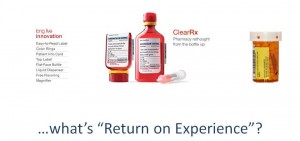
The panel then weighed in on Deborah Adler’s redesign of the Target Rx medicine bottles, which was bravely showcased by Microsoft as a UX case study from another industry during the second day keynote at Mix09.
It was a story arc that highlighted the many elements of ‘return on experience’ – everything from safety and customer satisfaction, through brand awareness and driving revenue.
- You can see the MIX09 keynote here.
- Read more about the Target Rx bottle redesign here.
- My initial thoughts on the MIX09 keynote (with more links) are here.
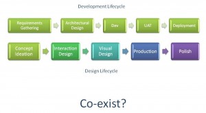
Then we reflected on the co-existence of the Development and Design lifecycles. There were varying opinions on where each person on the panel feels squeezed for time and resources in the cycle.
Ernie’s more thorough PM’s Gantt chart (very much not shown here) was a sobering dose of reality. We considered techniques for determining the point at which the value to the client diminishes when you add more time and resources.
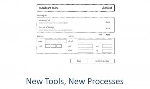
I did a Sketchflow demo. We created an interactive prototype. It had the “right level of fidelity” and the panel remarked that the “sketchy” look helps manage client expectations.
At a high level – there was love. Sketchflow should change our software development lifecycle.
But some easy things were hard. We integrated sample data (and Susan quite fairly called me on it when I talked about a designer “databinding” to “sample data.” (If Blend wants databinding to be [the designer’s] job then the designer says “but it’s not my job!”). We looked at editing a data template (for a Listbox full of items) and everyone agreed this experience was currently way too hard without grokking a number of Blend and XAML-specific concepts.
Especially valuable is Sketchflow’s ability to solicit feedback from clients with standalone prototypes. Ernie remarked that it was when he saw Sketchflow run “live” as a standalone prototype that he saw how valuable it could be. Integrated client feedback was a big win. We also saw how it can generate Word doc summaries, and all eyes lit up.
We remarked on its incredible potential, which it’s not quite living up to just yet. Earlier on in the presentation, we’d hit upon this theme that a good user experience should never make the user “feel stupid” – but for new users Sketchflow can unfortunately make some of its target audience feel stupid.
For a v1, though – wow – we all saw the value, and deeply, desperately want it to be awesome. Ernie said he’d go back to his team the next day and tell them to start using it.
- Download Blend3+Sketchflow trial here.
- These are the most thorough Sketchflow tutorials I’ve watched.
- If you have less time, watch Qixing’s Sketchflow mini-tutorials.
- In case you don’t know, Sketchflow channels the ideas of Bill Buxton from Microsoft Research.
- Specifically, it channels the ideas in his book, Sketching User Experiences.
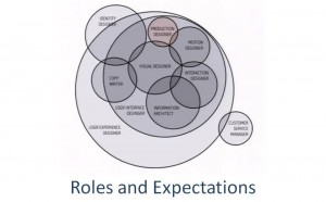
After the break, we talked about roles and expectations. Given the changing tools and processes, we wondered what should be expected of different roles.
We noted how “designer” is a “suitcase word” that carries many different meanings. Susan saw all these “people” in the Venn Diagram and just wanted it to be clear that in real life, it’s often all a single, multi-faceted “person.”
- The diagram is from Robby Ingebretsen’s incredible Design Fundamentals for Developers presentation, which is highly-recommended perspective-broadening stuff.
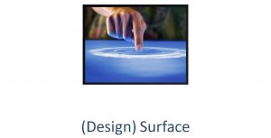
Most of the panel are, or have been, involved in Infusion’s Surface projects, so we took a moment to talk about design and user experience as they relate to that platform.
Susan remarked that Surface development demands UX design skills “to the extreme.”
The Surface design challenges include: attracting the attention of casual users, encouraging users to overcome the novelty of simultaneous multi-user interaction, and embracing the lack of an “up” direction. It’s “hyper-real,” and there is a need to consider the affordances of design elements used on this multi-user touch-table application.
- Joe Fletcher’s MIX09 Surface Session considered the nuances of Surface UX design
- Infusion makes Surface apps.
- FalconEye is a cool Surface app and there are videos of FalconEye and other Infusion surface apps here.
We had Dan Wilcox from the games industry, so we also asked him what we can learn from the gaming world if we’re trying to build line-of-business apps instead.
Dan agreed that a significant challenge is showing users what they can interact with, and how. That “affordances” thing again. He talked about how the games industry has improved in its ability to guide people through 3D landscapes, and perhaps similar cues could influence navigation through user interfaces. He gave examples of where games are blurring the boundaries between user interface and game world.
- Frozen North Productions is working on the Wii title Flip’s Twisted World.
- Affordance Theory is per Gibson,
- and you should check out Don Norman’s book too (see above re: the teapot),
- as well as the Henry Dreyfuss classic Designing for People.
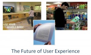
Then we talked about the future, because that’s always fun.
But the twist here was: what kind of UX considerations will come into play as we design for new kinds of interactivity?
We ran out of time because we wanted to run down the street to see the Surface app before Rogers closed, but now you have time to explore, and add your own thoughts below…
- This MIT Media Lab Augmented Reality system projects context-sensitive information, and employs gesture, image recognition and tagging.
- The Nearest Tube on the iPhone is a great augmented reality app.
- Layar is an Augmented Reality browser.
- Project Natal’s use of the whole body to interact examines scenarios focused around the living room (and Johnny Lee is on board)
- What will be the UX of E-paper – will every surface be a Surface?
- How do we design for interfaces with no touch, only nearness?


2 comments
Comments are closed.